 Android 4.0, also known as Ice Cream Sandwich, marks the start of a new era for Google's mobile platform. The release ushers in the biggest changes the software has seen since the launch of Froyo in 2010--maybe even Eclair back in 2009. Nearly every facet of the OS has been made over, and the very core of the Android user experience has been completely reimagined.
The more you use Ice Cream Sandwich, the more you realize just how radical a change it represents.
(Note: For the purposes of this review, I'm focusing on the smartphone side of Ice Cream Sandwich. At the time of this publication, the software had not yet been made available on any tablets.)
[READ: Image Gallery: Google's Ice Cream Sandwich]
Getting to Know Ice Cream Sandwich
The first thing you notice when you start using Ice Cream Sandwich is that Android suddenly seems a lot more friendly. While the OS has always been powerful and versatile, simple human relations weren't exactly its strong suit.
Now, powering up an Android 4.0 device (in my case, the Samsung Galaxy Nexus, which I've been testing for several days) is like running into an old college buddy who's evolved into a slick professional. He has the same smarts, the same heart and soul you've always appreciated, but now he really has his act together--and he's dressing better, to boot.
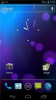
At a glance, Ice Cream Sandwich seems similar to the Android of years past. You have five home screen panels that hold any combination of app shortcuts, folders and live functioning widgets. Each is made up of an invisible grid that, like previous phone-based versions of Android, can support as many as 16 shortcuts (four across and four down). But beneath that basic shell, ICS is a whole new game.
You can practically see the fresh paint everywhere you look in the system. Gone are the harsh green and black colors of yore, replaced now with a soft blue-and-gray-based scheme. System icons are more brilliant, with bright colors and three-dimensional textures. New transitions and animations are sprinkled throughout the OS, adding subtle but important layers of polish.
![]()
 Click to ZoomAs for the home screen itself, Ice Cream Sandwich provides a new favorites tray that stays in place at the bottom of the screen as you swipe from one panel to another. The tray houses a permanent link to your app drawer along with four customizable icons; you can anchor any shortcut or folder into those spots by simply dragging and dropping it into place.
ICS also introduces a new persistent search box across the top of the home screen. Tapping the main part of the box brings up Android's universal search field, which simultaneously covers the Web and most content on your phone. Tapping the microphone at right end of the box, meanwhile, brings up Google's Voice Actions utility, which allows you to conduct a Web search, place a phone call, send a text or email, or get driving directions by speaking into your device.
(Don't tell Siri, but that's actually a function Android has had for more than a year.)
The Button-Free Philosophy
Perhaps the most striking shift with Ice Cream Sandwich is its move away from the four physical buttons that have long been Android phones' most identifiable feature. In fact, the Galaxy Nexus--the flagship Android 4.0 phone--has no buttons on its face whatsoever.
![]()
 Click to ZoomInstead, you get a trio of virtual buttons at the bottom of the display: one to go back a step, one to return to your home screen, and one to multitask, or toggle among recently used applications. These buttons will be familiar to Android tablet users; they actually first appeared in Honeycomb, as did an early implementation of the button-free philosophy. But for Android phones, they mark a major shift.
As someone who's used Android intensely for years, I expected the lack of physical buttons to be a shock. I'm happy to say, though, that I've found the adjustment surprisingly painless. It's really a natural evolution, as the on-screen buttons appear when and where you need them. If you rotate your device to a horizontal position, they move along with it. And if you don't need them on-screen--say, if you're viewing a photo or video--they disappear, turning into tiny dots that can emerge when beckoned but stay out of your way otherwise.
That said, the shift in button strategy does change the way you interact with the phone, especially when it comes to the search and menu functions that used to have permanent places on the front of the device. The elimination of the menu function is intended to make Android more user-friendly: Rather than having to press your phone's menu button to find commands, as you did with previous versions of Android, apps designed for ICS show all your options in a new "action bar" that sits at the top of the screen. The action bar's commands are context-sensitive, too, so they vary based on what task you're performing.
When you open Google Voice, for example, the action bar gives you one icon to compose a new text, one to refresh your inbox, and one that holds an overflow list of less commonly used functions (Ice Cream Sandwich's on-screen equivalent of the old menu button). When you're viewing an actual message in Google Voice, the action bar changes to give you options to call the person from your conversation or compose a new message to someone else.
This approach is excellent in theory. In execution, however, it has one glaring problem: Ice Cream Sandwich lacks a certain level of consistency with the placement of some key functions. Search, for example, is sometimes an icon in the action bar, and other times an option in the on-screen overflow menu (as is the case in Google Voice).
Even that overflow menu itself moves around somewhat from application to application: On most apps that have been optimized for ICS, it lives within the action bar at the top. But on older apps that have not been updated to reflect the new design standards, it appears squished in alongside the main navigation icons at the bottom. A similar inconsistency occurred within Honeycomb. My hope is that, as the new interface reaches more and more devices, app developers will update their programs to support the new approach.
(With existing phones that have physical buttons, by the way, the physical buttons will continue to function as they always have; you'll just use those instead of the new on-screen alternatives. The full ICS effect will be seen only on the Galaxy Nexus and subsequent button-free devices.)
Next: Home Screen Customization, Notification, the Keyboard and more
Source: http://feeds.pcworld.com/click.phdo?i=30763162f312713a18bb8b58bea6b9a3
connie hamzy florida gators anaheim ducks dream act senate blue valentine christina aguilera racy photos elizabeth edwards died
No comments:
Post a Comment